One of the most interesting things I found looking at my web traffic reports for this site following the publication of my article, “Develop Hybrid Native and Mobile Web Apps” in the March 2012 issue of MSDN Magazine was how many iPad browsers were accessing the site. Not surprisingly given my background as a Microsoft developer, my statistics were dominated by Internet Explorer but the iPad, iPhone, and Android platforms accounted for approximately 13% of the unique visits to my site. Knowing that my site was designed for primarily desktop browsers, I immediately wondered what the site might look like to those users and how usable it might be. The short answer to those questions was: It looked awful and was completely unusable!
In the US, there were 250 million mobile phones and 100 million smartphones at the end of 2011. While most of the focus for mobile development was here given the scale, product strategy professionals also turned their attention to tablets (33.7 million) and eReaders (25.1 million) according to Forrester Research Consumer PC And Tablet Forecast, 2011 To 2016 (US) and Forrester Research eReader Adoption Forecast, 2011 To 2016 (US) respectively. At EffectiveUI, one of the big trends that we are seeing is a rapid shift away from traditional desktop browsing experience to a multimodal experience encompassing smartphones, tablets, laptops, and traditional desktops. Given these multimodal requirements, developers are faced with a choice of building tailored experiences for each viewing platform or building a responsive design that smoothly accommodates a wide range of devices. I’ve talked in the past in my post on the EffectiveUI Blog, “Mobile Web, Hybrid, or Native Mobile – How Do You Choose?”, about the decision process for choosing to build a Mobile Web, Hybrid, or Native Mobile application and the decision tree for choosing a responsive design or platform specific designs is very similar.
Because of the fact that this site is largely intended for reading and is not a particularly interactive application, the responsive design option was the obvious choice to me. Responsive design uses CSS media queries in order to rearrange the layout of the site based on different widths. It takes advantage of well structured, semantic HTML markup in order to present a view of the site that is appropriate for each device while still giving all users the full functionality and content of the site.
The most common method of approaching responsive design is “mobile-first,” however, because I had an existing layout that was designed for an 800 pixel wide minimum, I started from my existing layout and then designed around that. There are two possible choices for determining where your design’s breakpoints are: device specific, and content first. In device specific, you set the breakpoints based on the width of the devices that are the most common visitors to your site and the devices that you want to support. The second approach is to let your content dictate the where the breakpoints are by setting a breakpoint at the widths where the content of the site starts to look stretched or out of proportion. The process of finding content specific breakpoints is a largely based on feel and you can have as many as you want. For this site, I chose the following breakpoints:
- 577 pixels
- 640 pixels
- 800 pixels (Original Design)
- and 1075 pixels
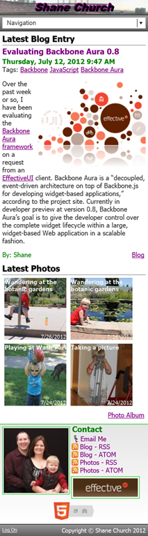
For anything below 577 pixels in width, I am showing the mobile layout as shown on the right. The navigation is collapsed into a drop down list and the sidebar is moved to the bottom of the page. Each photo in the Latest Photos section is also floated left so that they wrap appropriately so that the Latest Photos section expands to the bottom of the page.
At 577 pixels, the only change is that there is now enough real estate to show the standard navigation, so that replaces the drop down list as shown below.

The next major change comes at 640 pixels in width. At this point, there is enough width to practically move the sidebar back to the right hand column without adversely crunching the Latest Photos section on the bottom. This change is shown below.

At 800 pixels, I am back to my original layout so the site stops attempting to fill the full screen width and the side gutters appear again. This also leaves a nicely matched Latest Photos section of three rows of four.

The final breakpoint is at 1075 pixels. At this point, the main container expands again to take advantage of the expanded width for more text horizontally. The Latest Photos section breaks nicely here into two rows of six.
Much to my surprise, the basic process of making the site responsive was relatively simple. At each point, I use a CSS media query like @media only screen and (min-width: 1075px) { } to change the styling of the HTML elements, but there aren’t any changes to the site markup. Clean, semantic HTML5 markup makes the process of making a site responsive significantly easier. The only place where I had a significant challenge in the responsive transition is in handling modal dialogs like when an individual picture is clicked. I’m not entirely happy with where that solution is at this point, but it works. On this site, I intentionally don’t minify my CSS and JavaScript so that you can view my code for your own reference, so please feel free to look at the code and let me know if you have any thoughts or questions.